The Met Gala is the creation of Anna Wintour, chief editor of Vogue US, and she manages to outdo herself every year. This has become one of the major if not major fund-raiser for the Met. It is certainly one of the most famous events that help keep the Met on the minds of people. The Costume Institue was formed in 1946 and held a permanent gallery in the basement of the museum. In 1995 Anna Wintour started her co-chairing position with the fund-raising gala and it has become one of the top fashion events like the red carpets used to command.
Here’s my review of some of the highlights!
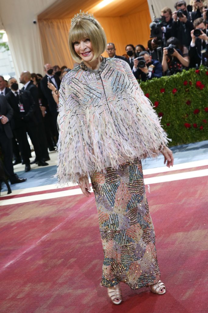
Anna Wintour never ever disappoints in that she always wears something fresh, new, forward and yet never weird or too abstract. She is after all a working woman and has a huge responsibility. If she were to appear too far out-there, her street creds would be sorely battered! This is a Chanel and she has always had a fondness for Chanel and wants to continue to support the House while it’s under transition from Karl Lagerfeld to the next creative head.
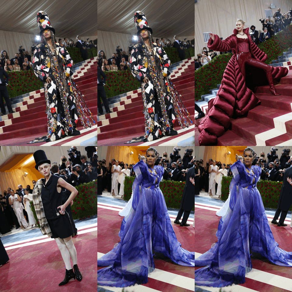
And there are always the ones who throw everything out the window and put on something only to garner attention. I suppose there is merit in this to some extent, but at my age, it bores me. I would much rather see a rebel the likes of Vera Wang in her first gowns which were rich with simplicity, beauty, and elegance.
But once you get past these, there were some very worthwhile designs.
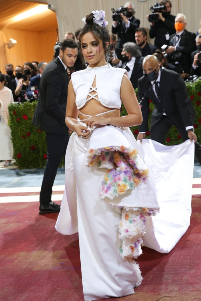
Although the top is a little iffy (this can’t be that comfortable to wear), the bottom has some fabulous ideas. Of course, the couture technique of those 3-D flowers on the inside of the skirt is killer fabulous.
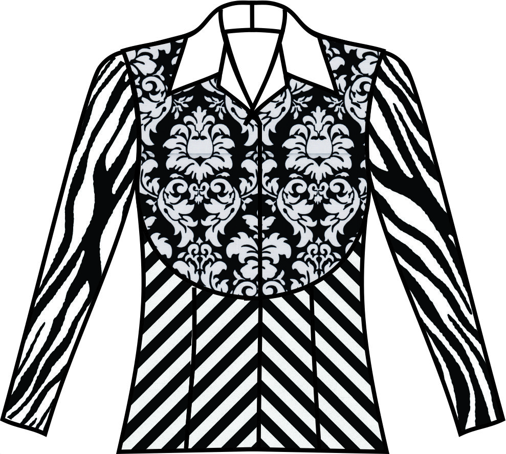
So how do you transform this into something exciting for those of us on the streets? Easy – use a very laid back top fashion fabric with an outlandish under fabric and voilá you have the perfect look.
This would be so killer for summer in a longish lightweight skirt that would button up the front. Leaving the button undone to the mid-knee, with the front-facing being the outlandish print, would make the outfit comfy and really exciting.
Not into long skirts? That’s ok cause this works for a street-length, slimmer skirt as well – either with a kick pleat in the back or again button but only above the knee so that walking sitting, there’s a flip of the fabric to see the outlandish on the inside.
BTW – I would “face” this (seam to seam) not fold under like a jacket facing so that the outlandish print would show just at a flip of the skirt hem.
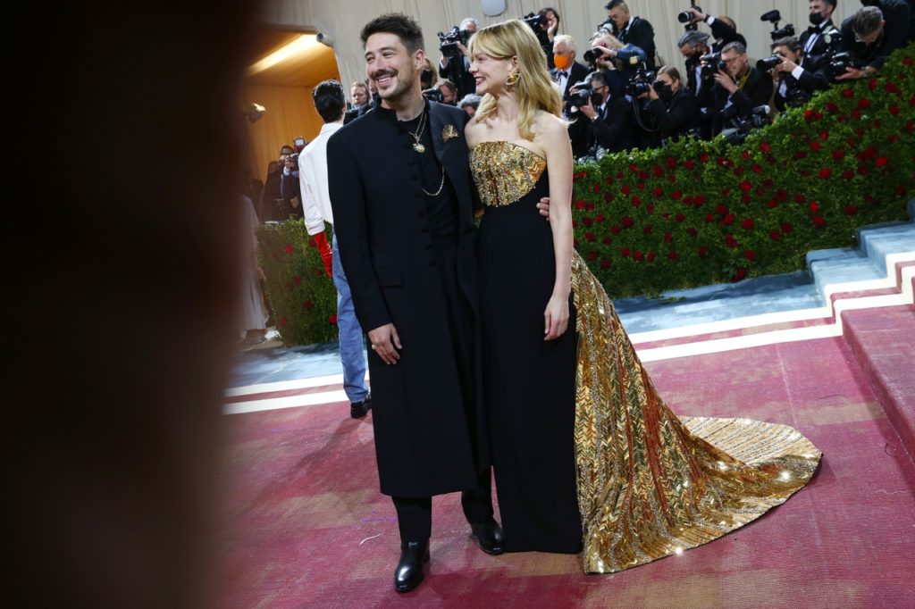
Again another great idea with this “bib” type front. I love the whole idea of this in a woven core pattern and drawing this bib front so that it goes from side to side at the top.
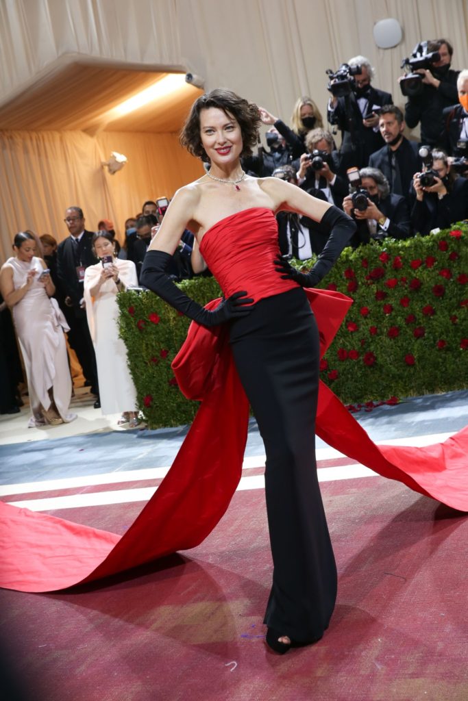
Believe it or not this is hard to do. The concept is a killer great concept, but it’s one of those things that’s so simple and yet so easy to mess up. The problem is that if the bow is too high, then it will eclipse the waist line of the model and make the model look like she’s think through the waist.
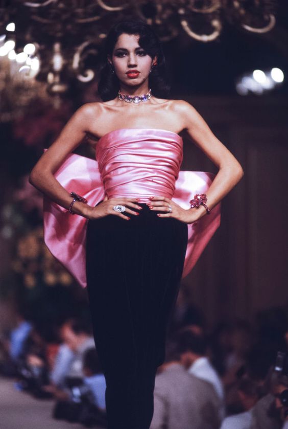
Yves St. Laurent masterfully did this with his famous pink-bow dress. See how the top of the skirt comes in tight around the waist? That’s the contrast that’s needed to make this work.
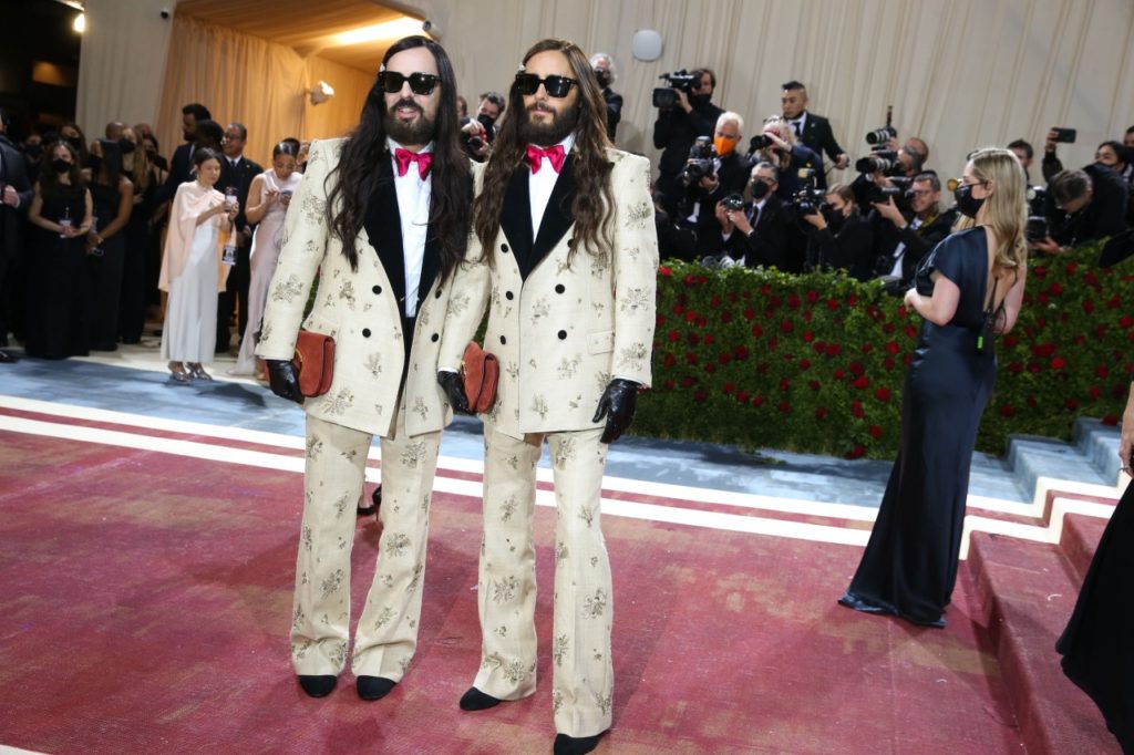
I know this looks a little like Tweedledum and Tweedledee, but there’s a good takeaway here – it’s in the hem of the pants. Both look different. The one on the left is a clear break in the crease of the pant, whereas the right is not so drastic a break. There are all sorts of creases you can make in your pant and both of these are correct.
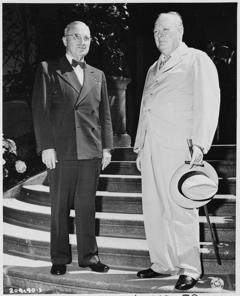
No Truman and Churchill weren’t at the Met Gala, but again, this makes a huge point about the hem length on pants. Here is the haberdasher from Missouri and the patron of Saville Row in London. Both are correct and yet they are both totally different.
Truman has a slight break in his pant on a double-breasted suit with a low stance (the position of the top button). Churchill has a single-breasted jacket with a hugely high stance and a cuff with a “full break” that looks like it’s almost a train. Both are correct in the tailoring world.
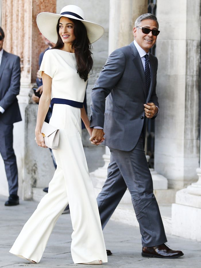
After much consternation on this, not only designing for myself, but also my clients, here’s the rule I like most:
Do a slight break for flats but if you are wearing even the shortest of heels or wedges, there’s no break. Here’s Amal Clooney in her beautifully long pants and they have no break and make a huge statement. A straight pant like this simply adds to the height of your body and makes you look slim, slim, slim. A slight break in a pant with flats, looks totally appropriate and works really well in keeping the pant from looking too short.
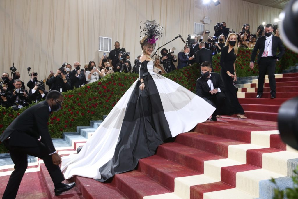
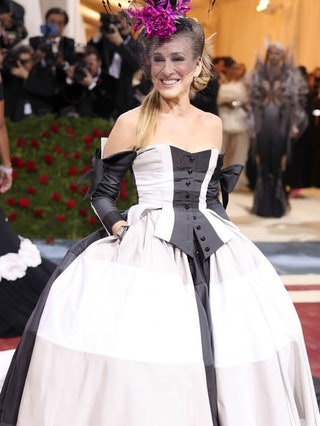
Sarah Jessica Parker never disappoints and always has something completely outlandish but hardly ever weird. Here she looks terrific in black and white – where’s Truman Capote when we need him?!
The more I look at this one, the more I love it. The collar, the cutaway in front, the high-waisted pants, the cuffs are all beautifully styled.
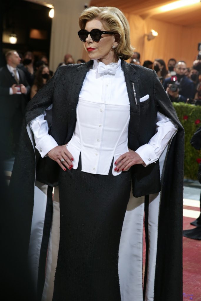
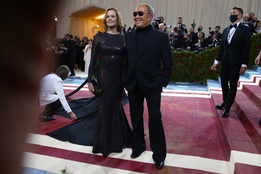
And there’s always the classic attendees and just like Jessica Parker, they don’t disappoint and give us great ideas about what good design really is. Christine Baranski and Segourney Weaver always look great.
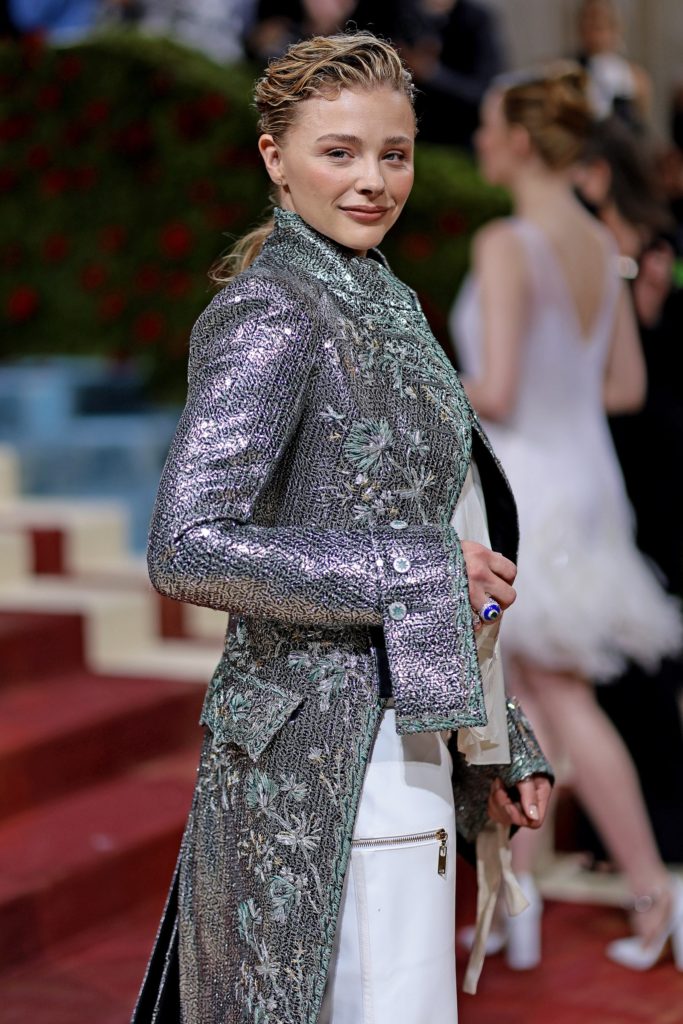
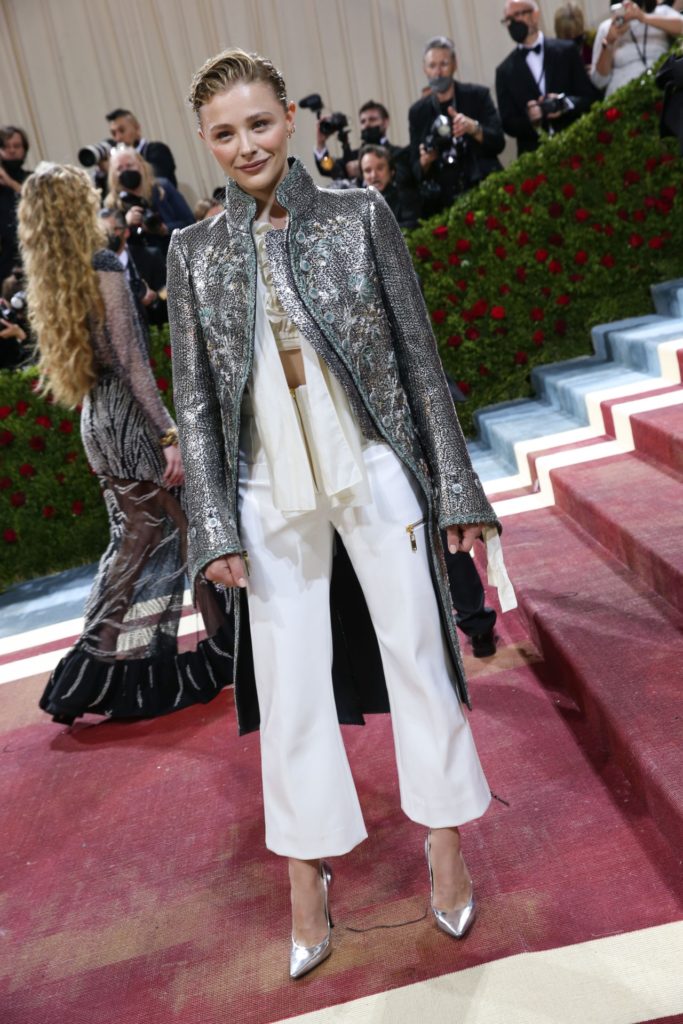
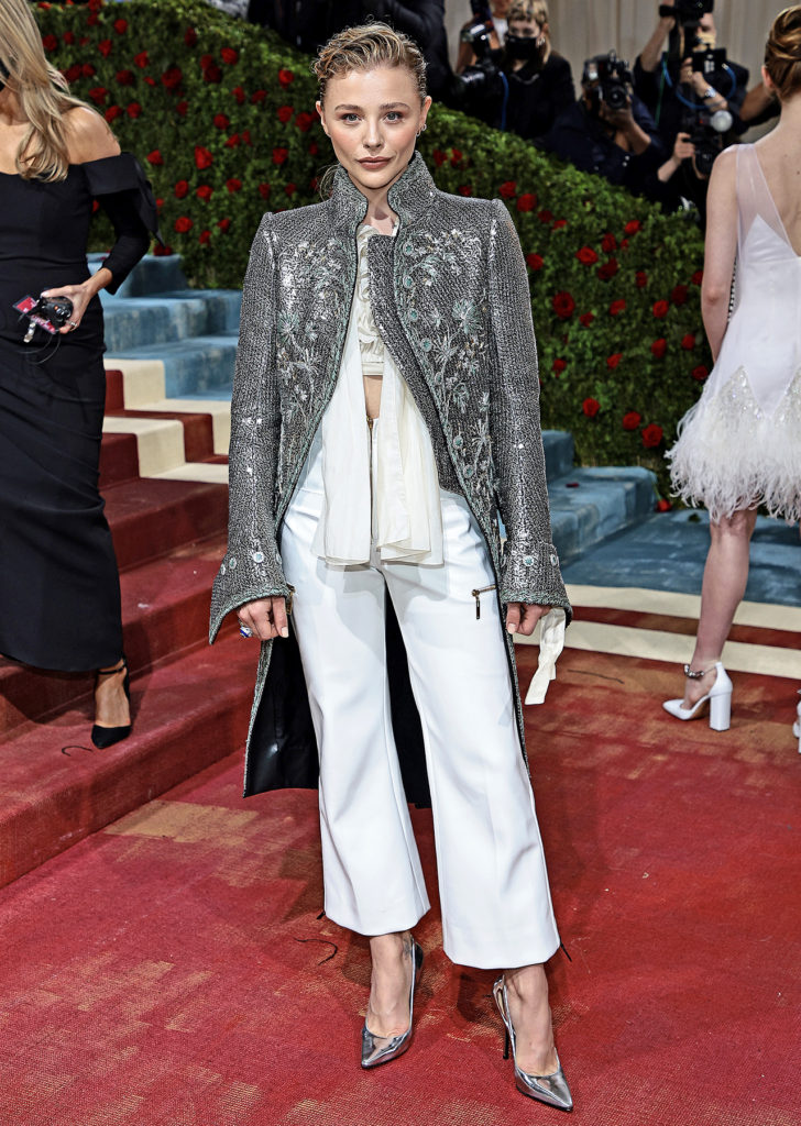
My favorite above all last night was this jacket that had the killer detail…the cuffs, the buttons, the back pockets, that look totally appropriate and yet totally useless – they are there only for design, but the design works. (Although I’d hate to sit on them). And the embroidery over the metallic fabric is just the sort of luxe I love.
The “theme” of the show was the Gilded Age, which was a period just after the Civil War and just before the turn of the century when industrialization brought huge growth – greater than in Europe and incredible garments.
Two of the attendees really stepped into the theme.
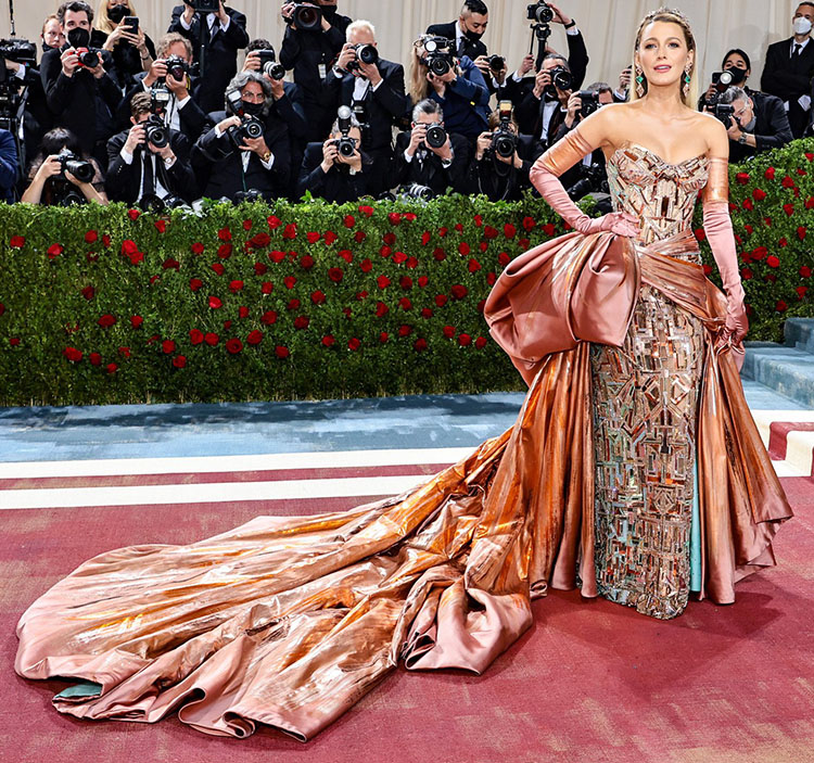
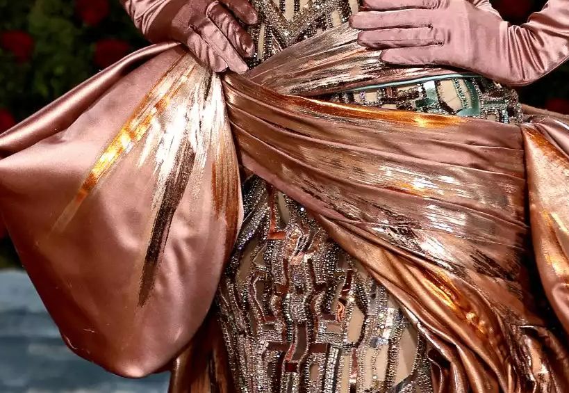
Lest you think this is just a simple satin over a nice printed fabric – it’s not. As you can see in this photo, that the dress is made up of beaded abstract parts over a see-thru netting. Then the satin is anything but a solid color, as it has many colors of a metallic abstract brushed design on it. So the complication of this certain fits the “Gilded Age” theme.
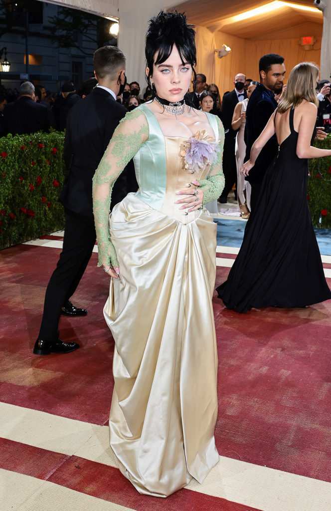
The same is true above, although you wonder how she could breathe at all with this corset being so tight as to push her bust up so high as to be practically under her chin! But the detail in the lace sleeves with the cuff being a partial glove calls for incredible fitting before that sleeve is even inserted.
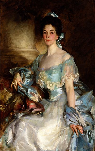
This look brings back visions of a John Singer Sargent portrait. The detail and elegance is hard to imagine.
